AmCap Brand Identity
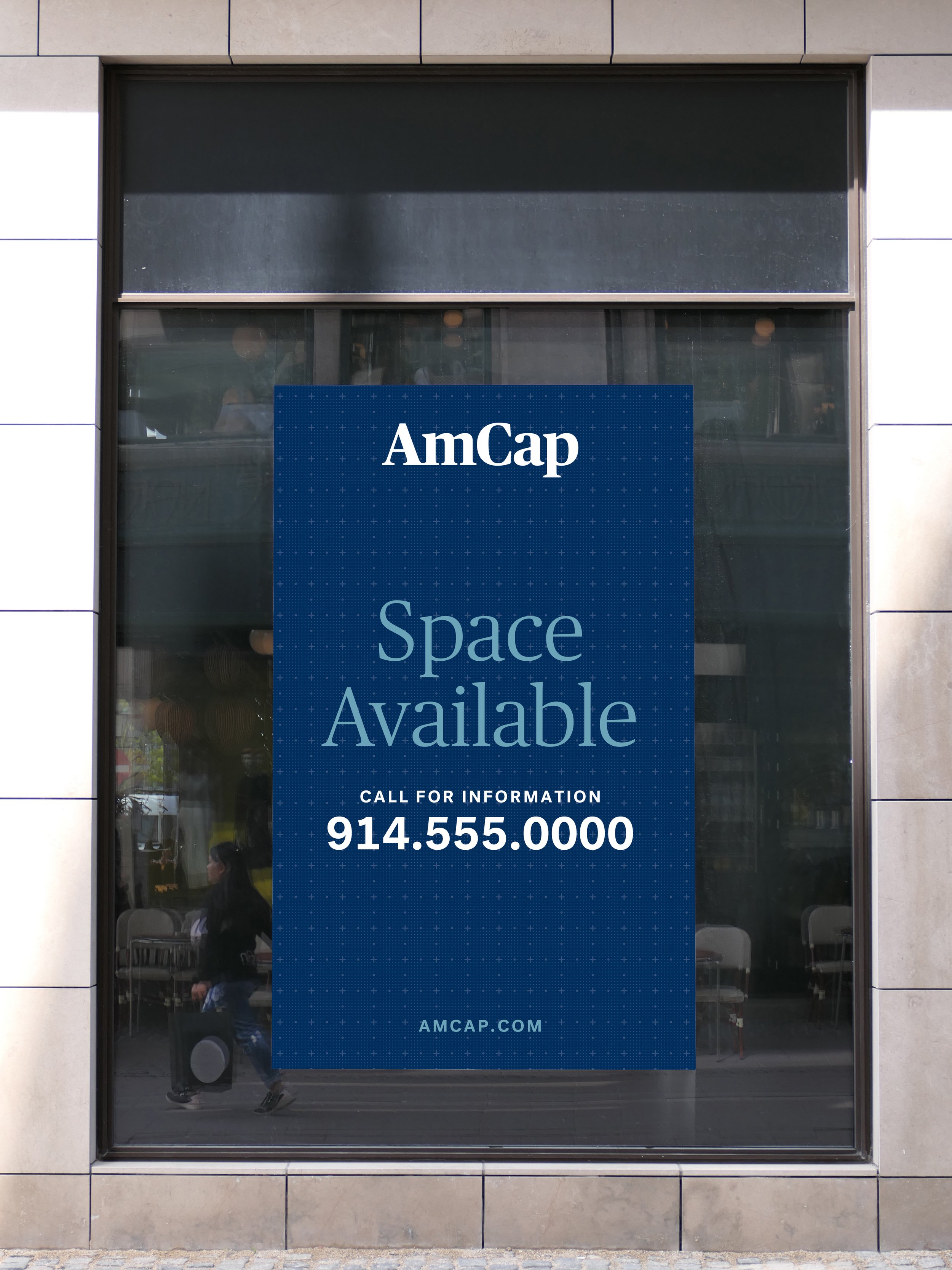
AmCap, a leading owner and operator of grocery-anchored shopping centers across the U.S., partnered with us to develop their next-generation logo and brand identity. We also revamped their stationery suite and PowerPoint presentation. In celebration of their fortieth anniversary, we designed a special 40th Anniversary logo to complement the new branding. Our goal was to create a brand that feels strong, trustworthy, and high-end, reflecting AmCap’s prominent position in the commercial real estate industry.
Client
AmCap Inc.
Categories
Real estate, branding
Scope
Brand logo and brand style, 40th-anniversary logo, stationery suite, PowerPoint template

Positive Logo

Knockout Logo

Black Logo
Brand Style
We chose elegant, modern typography that complements the new logo system and developed a sophisticated yet bold color palette. Additionally, we introduced a unique brand pattern inspired by architectural blueprints, symbolizing AmCap’s commitment to adding value in the commercial real estate market.
Brand palette & patterns


Stationery Suite
The stationery suite includes a business card, letterhead, and envelope, all reflecting the new brand identity and ensuring a cohesive, high-end presentation for AmCap.
PowerPoint Template
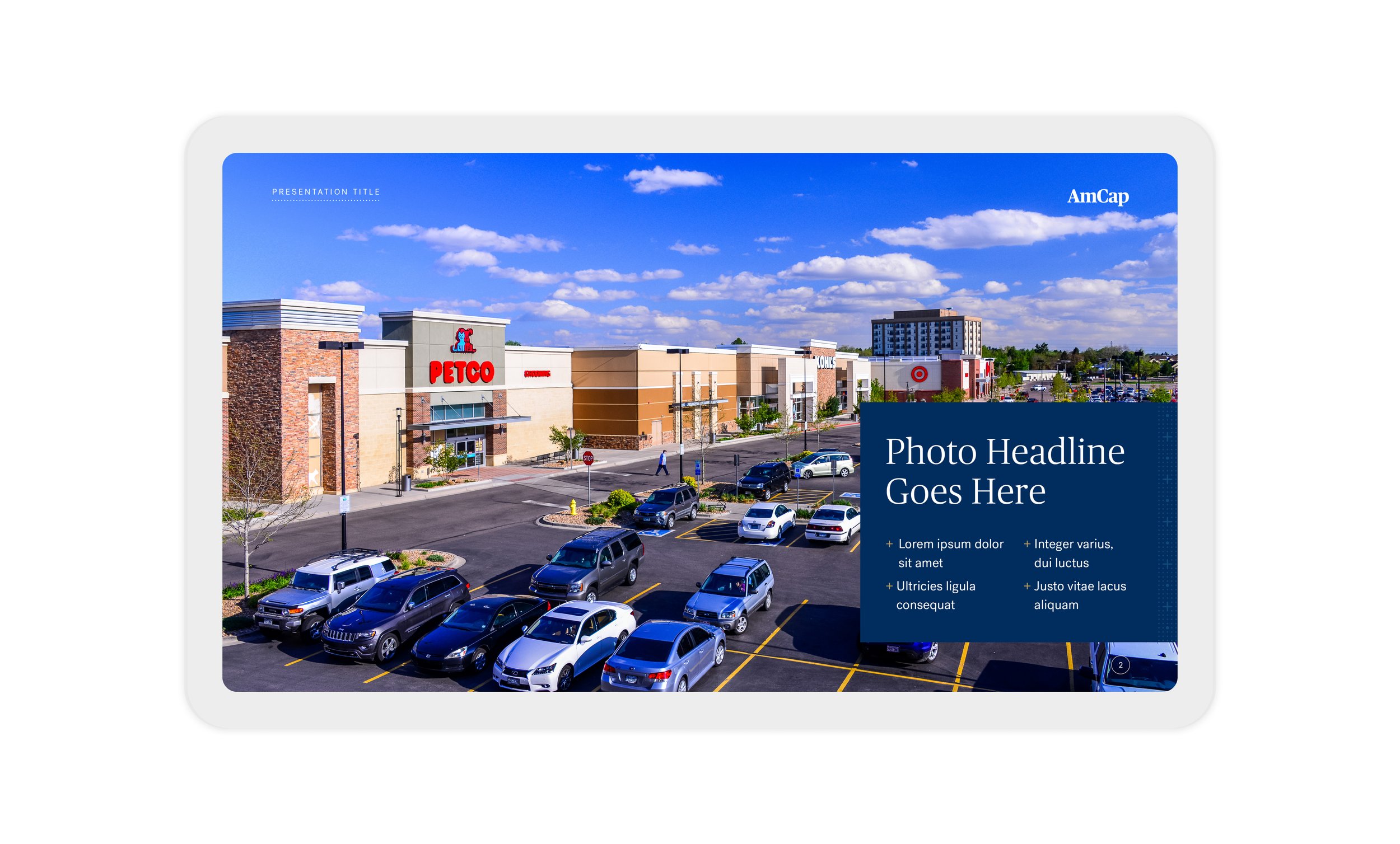
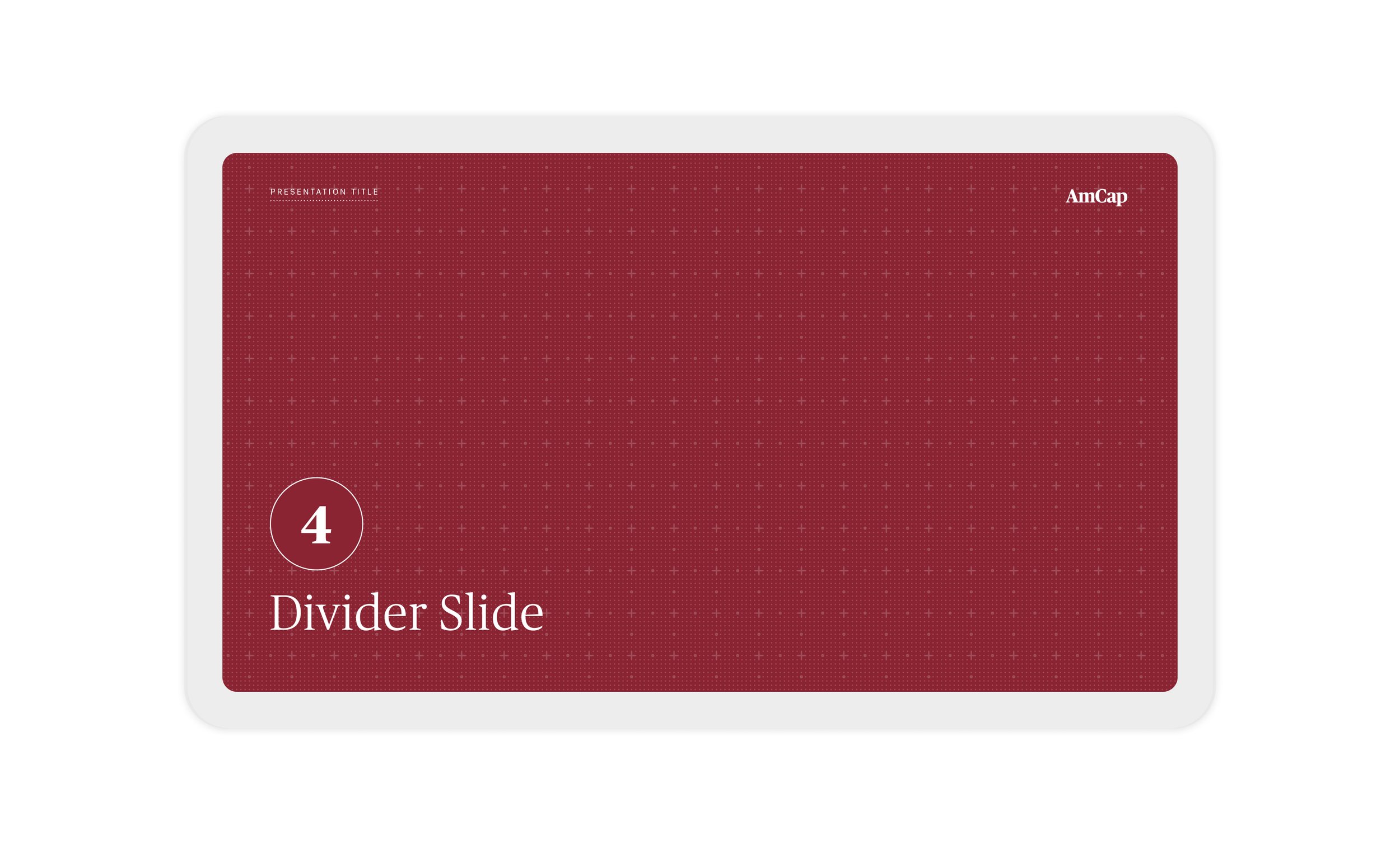
We developed a customizable PowerPoint template that highlights AmCap’s new brand style, featuring dramatic and elegant property photography whenever possible. A key focus was creating a flexible system to accommodate various layout needs, including text-only slides, tables, and statistical data, ensuring a visually cohesive and professional presentation.




40th Anniversary Logo
To celebrate AmCap’s fortieth anniversary, we designed a special edition of their logo for use on business cards, letterhead, website, and email signatures throughout the year. The anniversary logo featured a metallic silver ink, adding a premium touch to the brand’s milestone celebration.

Positive 40th Logo

Reverse 2-color 40th Logo

Knockout 40th Logo


