
The Pinnacle School Brand Identity
The Pinnacle School, a specialized education institution focusing on language-based learning differences, sought a brand redesign to reflect its innovative approach to education and the concept of growth in learning. Catering to students from grades 2-12, the new brand emphasizes joy, positivity, and enthusiasm to resonate with students, parents, and educators. The result is a clean, fresh logo and brand style that distinguishes the school from its peers and highlights its unique educational philosophy.
Client
The Pinnacle School
Scope
Logo, brand identity, brand style guide, stationery suite
Categories
Education, branding
Credits
Art Direction, Taylor Design
Recognition
2021, Connecticut Art Directors Club, Excellence Award
The Logo
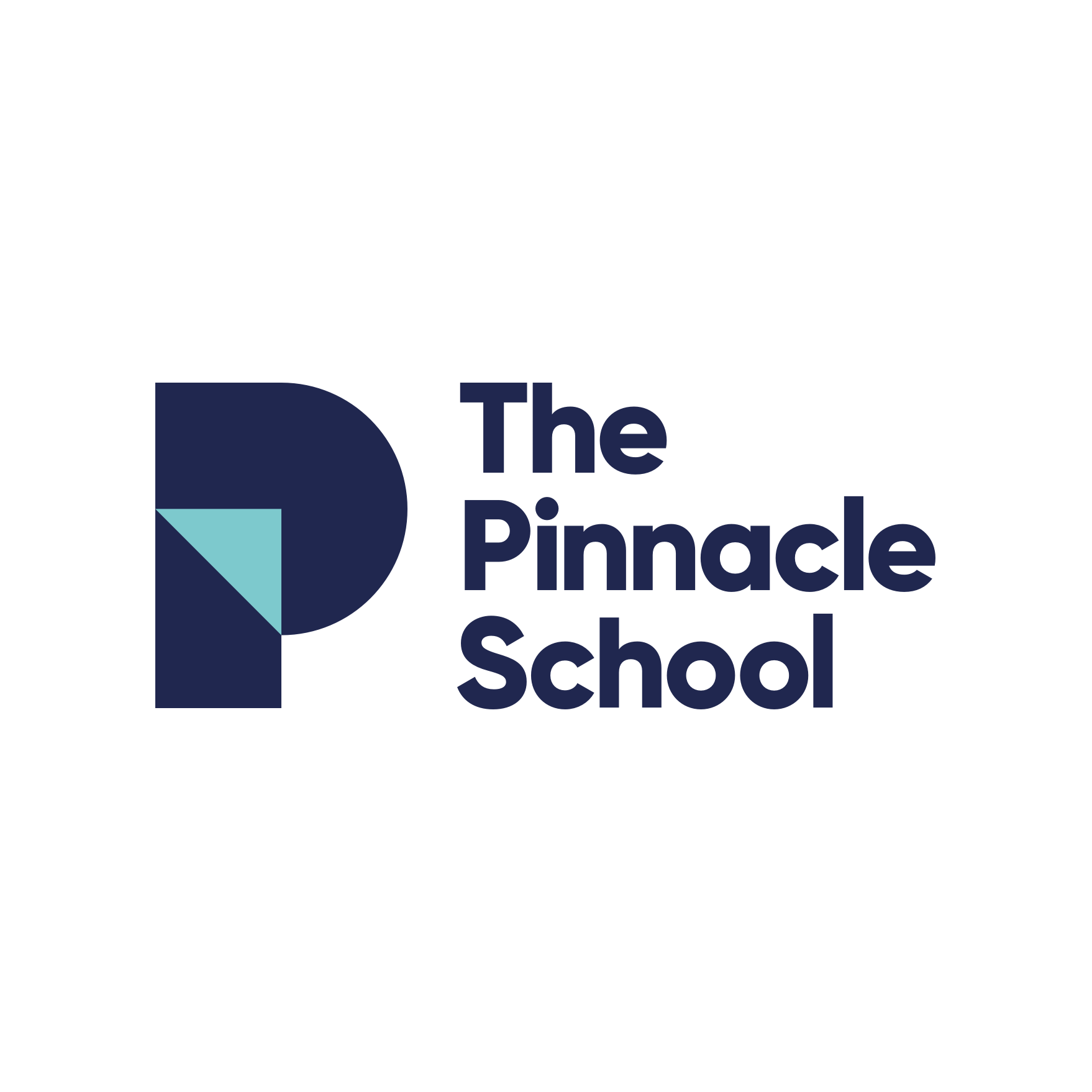
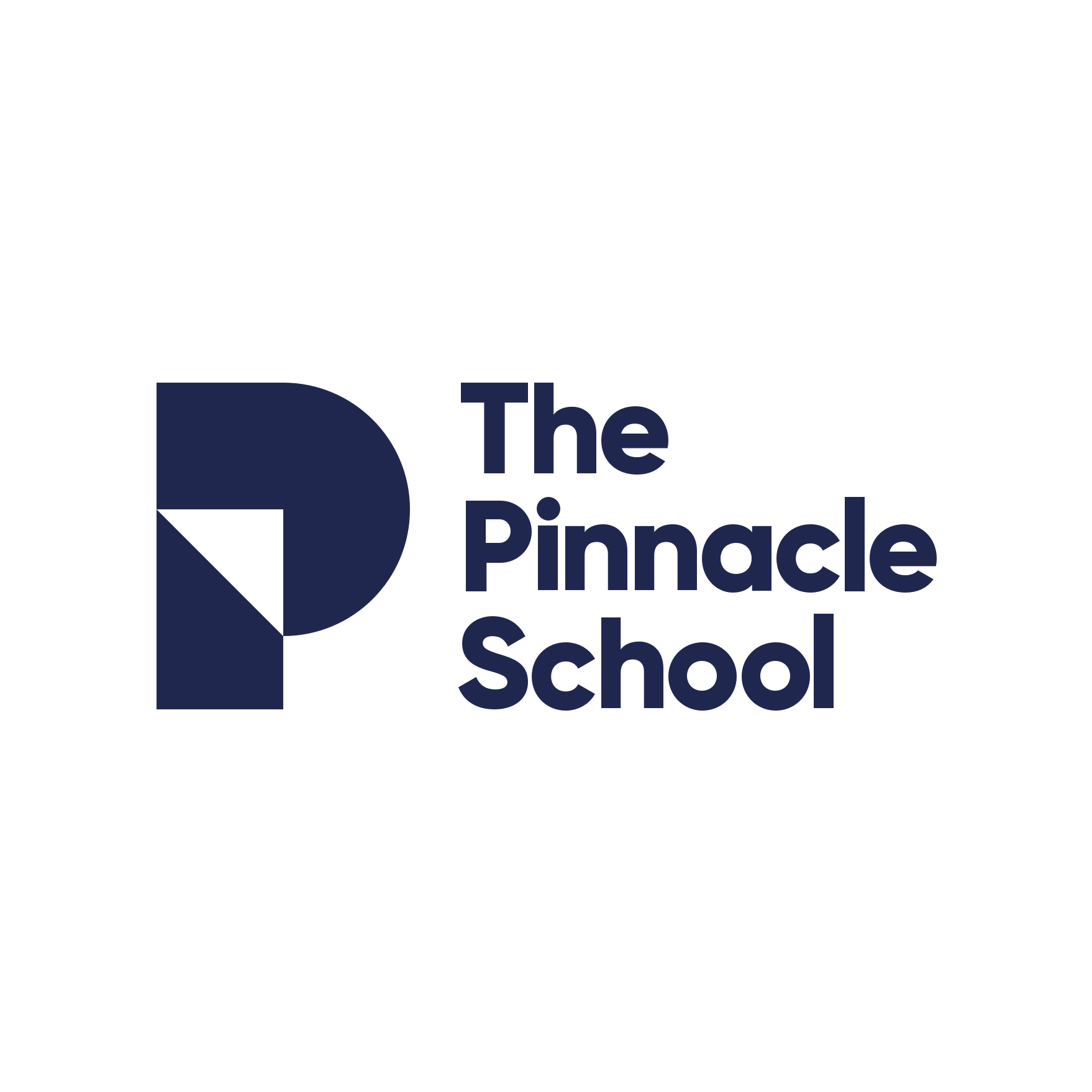
The Pinnacle School logo is designed to embody the school's name and the concept of progressing toward goals. The central triangle points to the heart of the letterform, symbolizing continuous growth and improvement. This version, known as the Primary 2-Color logo, is the preferred design. Additional alternate color options and orientations are provided for use in limited color situations and various layout needs.

Primary 2-Color Logo
1-Color Logo
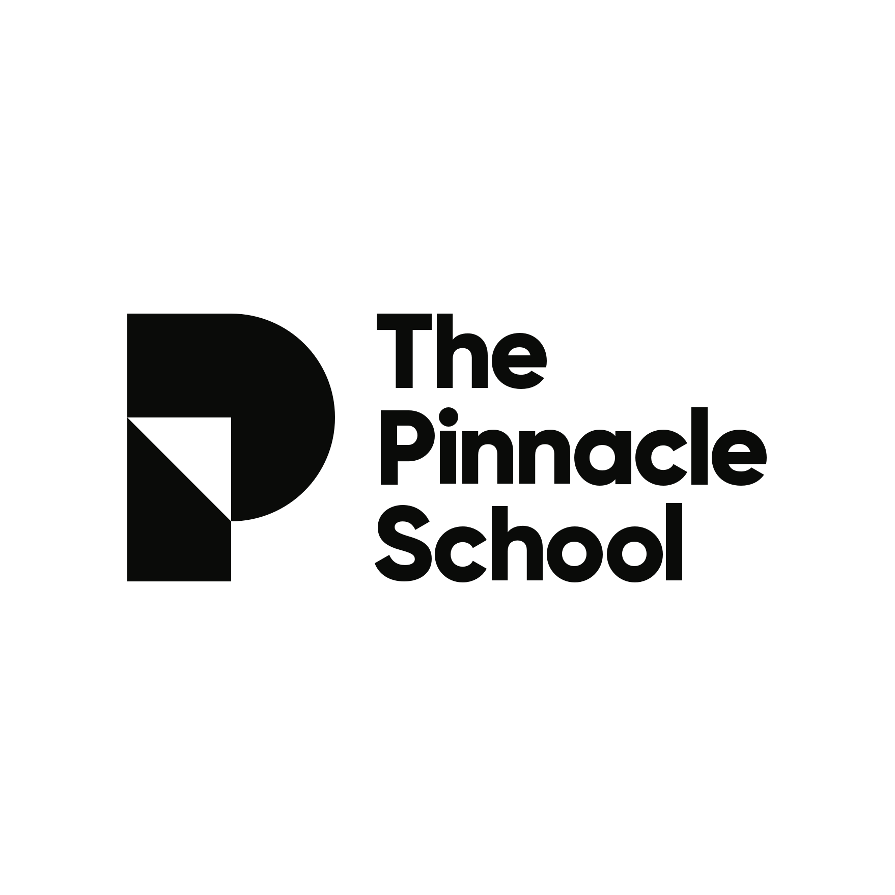
Black Logo
Reverse 2-Color Logo
Reverse 1-Color Logo

White Logo

The horizontal version of the logo is designed for use in areas with a wider proportion. It is ideal for applications such as horizontally oriented banners, pens, and lanyards, where a wider logo format enhances visibility and impact.

Stationery Suite
The stationery suite includes a business card, letterhead, and envelope, all designed to align with the new brand identity.

